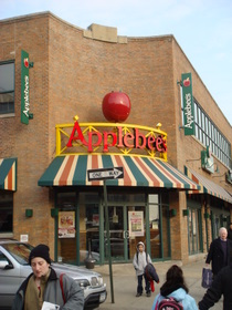
As I’ve mentioned before, we’ve got this little strip of suburban plastic at the southern end of Astoria. One of the bigger tenants is an Applebee’s.
And that Applebee’s has a big ol’ freakin’ apple on top of it.

When I saw this, I immediately thought of Campeche, Mexico. Like many Spanish colonial towns, Campeche didn’t have street signs at first. People referred to corners instead, and named them for objects or animals, which were marked with a drawing or a figure. In Campeche, the corner known as “el rincon del venado” is still marked by a somewhat battered statue of a deer (which I can’t find a photo of, unfortunately) atop one of the buildings.
This isn’t unique to Campeche. Most of medieval Europe used this same navigation, and it was handy in colonial towns where new streets were built and named quickly (and unmemorably–the Spanish just used numbers).
So the Applebee’s sign makes sense here in Queens–the streets here are also unmemorably numbered, and there is certainly a polyglot population.
But the bad aspect of medieval signage is that it was really adopted because no one could read.
Is that what’s happening now? It sure seems like it.
Especially because it’s not just Applebee’s.

Chili’s is probably even more thorough in this than Applebee’s is–most restaurants have the gigundo chili on it. And with its logo, Chili’s has gone so far as to take all but one of the letters out of its name:

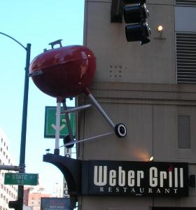
When I was in Chicago in January, we passed the Weber Grill restaurant. This has perhaps the most medieval look of all, the way it’s sticking off the building:

I can practically hear someone saying, “I’ll meet you at el rincon del Weber…”
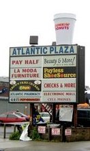
I was on the Upper West Side last week, and saw that Dunkin’ Donuts is following the trend too, by affixing a giant coffee cup to its awning. I didn’t get a picture of that, but here’s another version, out in Brooklyn:

What’s funny about this one is that there’s still lettering on the cup. Dunkin’ Donuts is basically admitting that it doesn’t “own” the takeaway coffee market–but it’s hoping that if it just makes its own logo big enough, it will suffice. (And can I add that it’s just plain sad that the more obvious symbol–duh, a doughnut!–is not even an option, due to health concerns.)
I knew standards in the U.S. were slipping–we’re more like a third-world country than anyone wants to admit. But if we’re going back to the illiterate Middle Ages on top of it all, it’s worse than I thought.
Any signs of diner illiteracy near you?